Showing posts with label design. Show all posts

5.31.2010

James Squire Guide to Beer

I love the way visualizations simplify decisionmaking. On a recent trip to Sydney I had dinner at James Squire, and when deciding which of their signature beers to pair with my meal, the following chart made my task a lot easier: 
It brought to mind this lovely number that was on display last year at Bobby Van's Steakhouse in Manhattan:
I find so much power in a simple two-axis matrix for choosing within a set of products. I'd love to see more services do this type of presentation to help consumers navigate the sometimes overwhelming choices that they are faced with. I've been thinking these types of presentations in the context of The Paradox of Choice by Barry Schwartz and Nudge by Thaler and Sunstein. Does this type of visualization make increasingly complex decisions easier to navigate? I tend to think so. I like an aromatic beer, with savory undertones, so I should choose an ale rather than a lager. Rather than struggling to identify the nuances between the myriad of beer choices, I'm given a useful map. What other types of choices can be simplified by a little visual design? I'd wager the categories are endless. It highlights to me the importance of empathy in design. If the first mantra of the information designer is to know the purpose of your data, the second may be to respect your audience. Be aware that as a designer you're steering them to a product, you may as well steer them to the product they're going to like the most. 

3.31.2010

Transparency Camp

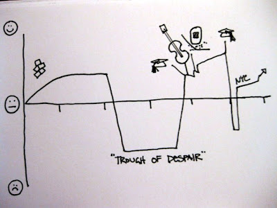
Transparency Camp was great! I facilitated a session on intellectual accessibility and data visualization. The conversation started with the image below:


Right off the bat, Brian Behlendorf from Health and Human Services guessed that it was happiness over the course of a person's life. Totally threw me for a loop (as I've never presented this graphic before). Apparently the "Trough of Despair" (a.k.a. middle school and high school) is a little hard to miss. I think it still works as a demonstration of the power of context and storytelling, tho.

We continued our discussion for with a meta visualization, laying out the types of data visualizations that are currently out there on a scatter plot with continuum axes.  I tend to think about info vis like this, as a matrix of options that fits into different families or categories. 
I'm kicking myself a little for not documenting the results of our discussion better. Never again shall I neglect to take pictures!

Something really interesting that came out of the conversation was the idea to establish a 'Visualizer Code of Ethics'. It was clear from our discussion that Information Designers such as myself can feel just as much pressure to massage our visualizations as do data analysts and statisticians. I think the challenge in a code of ethics is that a visualization relies on the story or message of the analysis. I've become increasingly conflicted regarding the use of pyramid and 3-D pie charts. I've always loathed their use, but what's the point of a graphic? If you think about the continuum of visualization methods above, statistical graphics are one small part of a universe of visual communication techniques. I've seen people painstakingly massage venn diagrams into the appropriate area relationships to represent percentages, and I have to ask, what's the point? As a concept graphic, a venn's purpose is to demonstrate intellectual relationship. If you're trying to show precise proportional relationship, there still isn't anything better than a bar chart. (Linear differences are so much easier to see than area differences.)

Maybe a good place to start with an visualization code of ethics is "know the purpose of your data".

3.11.2010

Google Public Data Explorer


I made the chart above using the new Public Data Explorer from Google. It doesn't have the capability to upload your own data set yet, but it's still pretty nifty. As is usually the case, the way the data set is structured has a huge impact on the ease of analysis. Some of the data sets have better categorization than others, and it isn't possible to select a whole set of variables at one time, which would be nice. As tools go, it's really easy to get the html needed to embed in any website. The base visualizations are really clean, which is fantastic, but the tool doesn't give much flexibility in terms of combining seemingly unrelated data sets (like showing rate of unemployment and HIV infection on the same chart). I'm looking forward to seeing how Google will handle the data uploading issue, as well as the continued development of the data files. Nat Torkington just wrote an illuminating post on open data formatting issues. I hope that (as he suggests) open data will follow in the model of the open source community.

3.09.2010

UPA Usability Metrics Workshop

I went to a great UPA workshop last month, presented by Bill Albert and Tom Tullis. It was a jam-packed day, covering a nearly overwhelming amount of content. Tom and Bill walked us through an overview of metric types and collection methods, and then concentrated on four different types of metrics: Performance, Self-Reported, Combined, and Observational.

One thing that struck me was the relationship between these metrics as they were presented. Performance and Self-Reported metrics are both gleaned through a structured interaction with a sample set of users. Combined metrics give an overall view of the health of an interaction, and are calculated using both Performance and Self-Reported metrics. Observational metrics are used less often than Performance metrics, and are seldom used in a Combined metric format.

Given that I've been working within a traditional survey-based market research environment for the past four years, I found the combination of these different types of performance indicators very interesting, especially given the practice of using self-reported data to create derived KPI (key performance indicators). It struck me that our rapidly changing access to data has the capacity to completely overhaul the way we approach measuring the success or failure of a product. Ultimately we must be able to demonstrate a profitable return on investment, but what happens when we have larger data sets to work with? Can we combine post-launch observational metrics with pre-launch performance tests to validate continuing development?

Market research and usability have their roots in the production and sale of products, not services. As we shift focus from the production of meatworld goods to the design of online services, we suddenly have the ability to approach larger and more disparate groups of consumers. With agile methodologies creating ever shorter development cycles, we have more opportunities to use our user communities as test subjects for working services. Google has famously tested 41 shades of blue for one of its toolbars, measuring click through rates to determine which shade is most appropriate. Services like Clickable provide the ability to make immediate decisions about search advertising ad copy. Users can see the real results on their pay per click online ads and use that information to refine their messaging (compare that to a six-week messaging study).  Granted, this is easy to do in a low-cost medium with infinite dimensions. (When a prototype takes at least a year to develop and costs at least a million dollars to produce, the barrier to this kind of live experimentation is high). Happily, we're living in a new age now, where interfaces and services and messages are expected to shift and grow and refine with changing consumer demand.

So what does this mean for usability metrics? For virtual services we will need to find a way to integrate those traditional metrics with live Observational metrics. Heck, we could even create a way to automate this type of reporting. I've got some ideas on how to do this, but that will have to wait for another day.

2.21.2010

OK Trends continues to kick ass

It looks like the folks at OK Cupid are paying attention to their critics. As I've mentioned before, their analysis is inspired, but their data graphics need some work. Case in point, this post about profile photo myths. The graphs had a lot of rookie mistakes.

For Example... the chart on the right was taken from OK Trends, and there are a number of problems. It's always a good idea to eliminate all unnecessary data pixels. The outlines around the bars of these charts provides some visual distraction that can easily be eliminated. In addition, the legend requires a bit of ocular calisthenics. Your brain only keeps five to nine bits of information in short-term memory. In order to read any chart you need to understand the numbers and the context. The further you remove the context from the numbers, the more your brain has to work to put the pieces together. In this example the numbers in green at the top of the chart can't be understood until you read the title at the top of the chart and the legend at the bottom. In the western world we read from left to right, top to bottom, but this chart forces the viewer to read the top, then the bottom, then side to side. While the green data series is the first you encounter with your eyes, it's the last that's listed in the legend.


My version of the chart is on the right. Notice the legend is on the right of the chart, in the same order as the data series. Your eye reads left to right, the way it naturally wants to. I added an axis showing the sum of all the categories, so you don't need to do the mental math to know that these are parts of a whole population. In addition, the unnecessary outlines around the data series have been removed.

What I find interesting is the use of a stacked column chart. I think sometimes the impulse is to use a stacked column chart to show data that adds to 100%. I tend to use stacked column charts when I'm showing categories on a continuum. At times it may be better to show the information in a clustered bar chart, like the next one shown here. It depends on what you're trying to express with the data graphic. All of these charts contain the same data, but the last chart makes it easier to see the differences between men and women when it comes to profile pictures. It also makes it easier to see relative differences between categories.

I'm really impressed with the improvements that OK Trends employed in their most recent post. They're employing a wider variety of visualizations, and the graphics they're using are much more sophisticated. If you look at the fourth chart I've posted here, the information is presented in a more manageable form. Grid lines have been provided for quick and easy reference, there's a label indicating the sample size, and the labels are all oriented so they can be read left to right. It makes me really happy to see their data graphics rise to the quality of their analysis.

2.13.2010

The internet is a beautiful place

I'm not sure if anyone else saw this post over at ReadWriteWeb. If not, you should give it a gander.

It occurs to me that this reveals something that we as designers and developers need to be reminded of from time to time. The internet is big, (like really, really big) and inherently unfamiliar, with a constantly changing map and unreliable landmarks.


I am reminded of a project I worked on, designing a food-related tool for the Japanese market. When creating a tool for a particular market, it's always important to understand both the physical and intellectual environment that the tool will be used in. I designed a collapsible bento box that can be stored in its wrapper, hung up on a wall. Does this product make sense in Agrestic, CA? Not at all, but for a Tokyo apartment, you bet!


The meaningful bit here is that when designing for the web, we sometimes become so focused on designing and developing for ourselves, or for early adopters, that we forget what happens when someone navigates by landmark. It's a shift from the intellectual environment that we expect. Take this map from Ryuch on Wikimedia Commons:
If the terrain of the Zhongshan Scenic area is unfamiliar to you, the landmarks are given helpful visual references. In other words, if you're trying to get to the big blue and white building at the center of the map, and you aren't seeing it, you're clearly not in the right place.

What does this have to do with the frustrated folks at ReadWriteWeb? I really think there are two things at play here. One being the intellectual environment of the user (which we can't control) and one being the information that we give to the user. We can't control the way that people navigate the web, but we can give them better (or at least more consistent) landmarks to go by.

Let's consider the most popular websites to be landmarks for the web: Google, YouTube, Facebook, MSN, Twitter, eBay, Hotmail, CNN, AOL. (I'm not including any porn here, sorry folks). What happens when the facade of these services changes? For those of us who are web savvy, we take a look at the URL, assure ourselves it was just another re-design, grumble about the old light bulb being so much better, and go on our merry way. What about those people that know where they are in downtown Brooklyn by finding the Williamsburg Savings Bank tower? Confusion! Chaos! Frustration! (These, by the way, are the people who are still using IE 6, not because of laziness, but because of comfort.) I think it's easy for us to laugh at these clueless rubes who can't seem to figure out that ReadWriteWeb isn't Facebook, but really, how are they supposed to know the difference? They're navigating still unfamiliar waters, taking the long way around because it's what they know, and the don't particularly care that there's a more efficient way.

The lesson here? Sure, make improvements, but what's wrong with sticking to familiar interfaces? Users don't like change, so make little changes on a regular basis. The older I get the more I admire the design that is taken for granted.

11.09.2009

My first sketch

So I just uploaded my first processing sketch to Open Processing. I finished the first three chapters in the Shiffman Processing text, so stay tuned for more sketches!

11.05.2009

Resonate Revisited


Oh the horror of those things languishing in the deep recesses of the storage spaces in my apartment. The truth is, I nearly killed my sewing machine putting this little beauty together, and am loathe for a repeat performance.

What you're looking at the top is a four foot by five foot flannel quilt, embedded with twenty 2-inch speakers. Those little puffs are constructed with box pleats, spacious enough for some poly fil and a maybe a speaker.


I slept under this blanket for a year, until the stitching between its twenty panels started to deteriorate from the strain. The pleating technique used one square yard of fabric to make one square foot panel. Add to that twenty pounds of fluffy stuffing and the heft of twenty speakers, and you've got a lot of pressure on the hand-stitching that kept the panels together. I tried stitch it all together with my sewing machine, but we're talking about eight layers of some pretty substantial fabric. I resorted to sewing it by hand, a project I always mean to take up again, someday. For now the separate components are stashed in the storage spaces in my apartment, laundered and waiting for a rainy day or rainy season, perhaps? The speakers have been glued into clear plastic orbs, in the hopes that a bit more space between the fluff and the diaphragm will allow for better sound output. I did some experiments with pillows embedded with speakers, and it seemed to work alright, though I may need to find a better speaker than the little 8 ohm piezos I picked up from American Science and Surplus.

Haven't you ever wanted to wrap yourself in a song?

11.04.2009

American West Revisited


I've always been fascinated by toy weapons... so much so that I did a re-branding project with American West caps when I was in design school.

My main memory of cap guns from childhood was watching a boy at music camp unrolling the paper caps and popping them on a piece of smooth cement with a rock, savoring the sulfur smell as he struck each powder dot.

The toy itself seemed so wasteful to me, with its vacuum formed plastic and cardboard packaging. In my revision, I like to think that some outlaw kid would staple the package to a belt they 'borrowed' from a parent and drape it across their chest like a bandoleer, given the opportunity. On the other hand, being uncomfortable with giving children toy weapons I kept with the old west theme, but surreptitiously played with the logo. (Note the surrendering American West figure at the center of the target/badge).

It's never seemed right to me to give a pretend deadly weapon to a kid. Let them make their own, I say.