3.31.2010

Transparency Camp

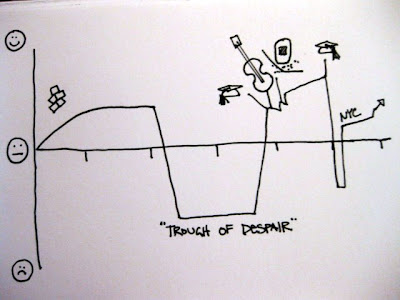
Transparency Camp was great! I facilitated a session on intellectual accessibility and data visualization. The conversation started with the image below:


Right off the bat, Brian Behlendorf from Health and Human Services guessed that it was happiness over the course of a person's life. Totally threw me for a loop (as I've never presented this graphic before). Apparently the "Trough of Despair" (a.k.a. middle school and high school) is a little hard to miss. I think it still works as a demonstration of the power of context and storytelling, tho.

We continued our discussion for with a meta visualization, laying out the types of data visualizations that are currently out there on a scatter plot with continuum axes.  I tend to think about info vis like this, as a matrix of options that fits into different families or categories. 
I'm kicking myself a little for not documenting the results of our discussion better. Never again shall I neglect to take pictures!

Something really interesting that came out of the conversation was the idea to establish a 'Visualizer Code of Ethics'. It was clear from our discussion that Information Designers such as myself can feel just as much pressure to massage our visualizations as do data analysts and statisticians. I think the challenge in a code of ethics is that a visualization relies on the story or message of the analysis. I've become increasingly conflicted regarding the use of pyramid and 3-D pie charts. I've always loathed their use, but what's the point of a graphic? If you think about the continuum of visualization methods above, statistical graphics are one small part of a universe of visual communication techniques. I've seen people painstakingly massage venn diagrams into the appropriate area relationships to represent percentages, and I have to ask, what's the point? As a concept graphic, a venn's purpose is to demonstrate intellectual relationship. If you're trying to show precise proportional relationship, there still isn't anything better than a bar chart. (Linear differences are so much easier to see than area differences.)

Maybe a good place to start with an visualization code of ethics is "know the purpose of your data".

3.11.2010

Google Public Data Explorer


I made the chart above using the new Public Data Explorer from Google. It doesn't have the capability to upload your own data set yet, but it's still pretty nifty. As is usually the case, the way the data set is structured has a huge impact on the ease of analysis. Some of the data sets have better categorization than others, and it isn't possible to select a whole set of variables at one time, which would be nice. As tools go, it's really easy to get the html needed to embed in any website. The base visualizations are really clean, which is fantastic, but the tool doesn't give much flexibility in terms of combining seemingly unrelated data sets (like showing rate of unemployment and HIV infection on the same chart). I'm looking forward to seeing how Google will handle the data uploading issue, as well as the continued development of the data files. Nat Torkington just wrote an illuminating post on open data formatting issues. I hope that (as he suggests) open data will follow in the model of the open source community.

3.09.2010

UPA Usability Metrics Workshop

I went to a great UPA workshop last month, presented by Bill Albert and Tom Tullis. It was a jam-packed day, covering a nearly overwhelming amount of content. Tom and Bill walked us through an overview of metric types and collection methods, and then concentrated on four different types of metrics: Performance, Self-Reported, Combined, and Observational.

One thing that struck me was the relationship between these metrics as they were presented. Performance and Self-Reported metrics are both gleaned through a structured interaction with a sample set of users. Combined metrics give an overall view of the health of an interaction, and are calculated using both Performance and Self-Reported metrics. Observational metrics are used less often than Performance metrics, and are seldom used in a Combined metric format.

Given that I've been working within a traditional survey-based market research environment for the past four years, I found the combination of these different types of performance indicators very interesting, especially given the practice of using self-reported data to create derived KPI (key performance indicators). It struck me that our rapidly changing access to data has the capacity to completely overhaul the way we approach measuring the success or failure of a product. Ultimately we must be able to demonstrate a profitable return on investment, but what happens when we have larger data sets to work with? Can we combine post-launch observational metrics with pre-launch performance tests to validate continuing development?

Market research and usability have their roots in the production and sale of products, not services. As we shift focus from the production of meatworld goods to the design of online services, we suddenly have the ability to approach larger and more disparate groups of consumers. With agile methodologies creating ever shorter development cycles, we have more opportunities to use our user communities as test subjects for working services. Google has famously tested 41 shades of blue for one of its toolbars, measuring click through rates to determine which shade is most appropriate. Services like Clickable provide the ability to make immediate decisions about search advertising ad copy. Users can see the real results on their pay per click online ads and use that information to refine their messaging (compare that to a six-week messaging study).  Granted, this is easy to do in a low-cost medium with infinite dimensions. (When a prototype takes at least a year to develop and costs at least a million dollars to produce, the barrier to this kind of live experimentation is high). Happily, we're living in a new age now, where interfaces and services and messages are expected to shift and grow and refine with changing consumer demand.

So what does this mean for usability metrics? For virtual services we will need to find a way to integrate those traditional metrics with live Observational metrics. Heck, we could even create a way to automate this type of reporting. I've got some ideas on how to do this, but that will have to wait for another day.